Adding Descriptive Link Text

As with link text on any platform, your links should make sense out of context so that those who navigate by screen reader can understand the link's purpose. Avoid generic link text such as "learn more" or "click here".
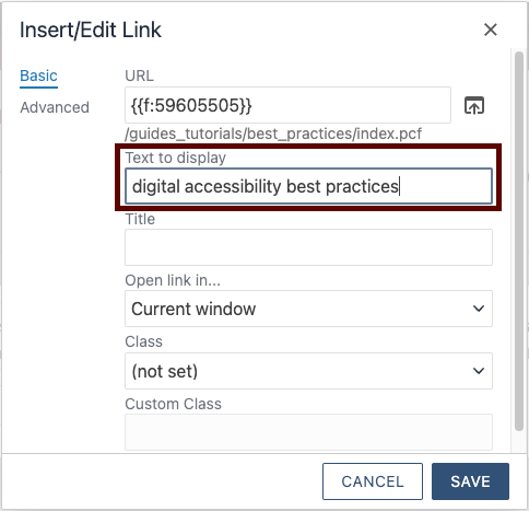
For basic links, select the "insert/edit link" button in the What You See is What You Get (WYSIWYG) toolbar, and write your descriptive link text in the "text to display" field.
The CMS will style your link in a garnet color and underline the display text so that your link stands out.

Pro Tip: Imagine your links' display text in a list format without the surrounding text content. What would you want your link text to be then? Think about how redundant "learn more" becomes.
Removing Links
Be careful when you remove a link to use the "remove link" button in the WYSIWYG toolbar. If you try to remove only the display text, there will be an empty link, or a link without a text alternative, left in your content.
Consider your Link Length
It's a balancing act, trying to write link text that is descriptive enough to convey the link's purpose, but concise enough that the link's length doesn't overwhelm the user. Long link text can be particularly frustrating for screen reader users who are blind or low vision and are trying to quickly understand the purpose of a link.
When you make the entire list item a link in flexible grid snippets, simple list snippets, or multipurpose list snippets, your links may become unnecessarily long. Try to keep your descriptions in these snippets brief, when possible.