How to Use Sufficient Color Contrast in Word
By using color contrast ratios that meet digital accessibility standards, you can make it much easier for people who are colorblind or low vision to read the text in your documents.
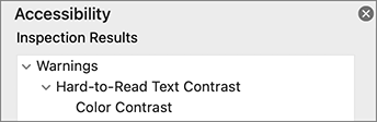
It is standard for documents in Microsoft Word to have a white background. Unfortunately, many of the standard colors offered by Microsoft Word do not have sufficient contrast against this white background. Microsoft Accessibility Checker will identify when you have Hard-to-Read Text Contrast under the Warnings portion of the checker.
Increasing your Color Contrast
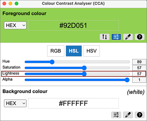
As with color contrast on any platform, you can use free contrast checker tools (e.g., TPGi's Color Contrast Analyzer) to check your contrast ratios. In addition to telling you the contrast ratio of your font color against its background, this tool feature a lightness slider that can help you find colors with higher contrast.