Writing Alt Text for an Infographic
Infographics often communicate important information to the user, and they need a two-part text alternative so that screen reader users have access to that information.
- Write a short description that identifies your infographic.
The short description can be very brief, with simply the title of the infographic and what type of information it is presenting. - Include any important text in your long description.
The long description of your infographic is where you should communicate all of the essential information from your image, including any important text that is part of your graphic.
Consider removing the text from your image and inserting it as live text on the page. Your alt text may need to include all of the text that occurs within the image if it is all important information that a screen reader would otherwise not have access to. - Account for the layout.
The order of information can be crucial to understanding the message of an infographic, so be sure to describe the layout of your graphic, such as where the text is placed in relation to the image, in addition to the whole of the content.
Example of Alt Text for an Infographic

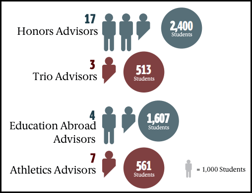
In the following infographic, different types of program advisors are mapped to the students they advise. The goal of the infographic is to portray the ratio of program advisors to students for four major programs.
Short Description: Infographic mapping types of program advisors to students they advise.
Long Description: The graphic portrays four types of program advisors stacked vertically. Each row states the count of the program advisors and their students advised. The top-most Honors Advisors have a count of 17 and advise 2,400 students. Next, there are 3 Trio Advisors who advise 513 students. Third, there are 4 Education Abroad Advisors who advise 1,607 students. Lastly, there are 7 Athletics Advisors who advise 561 students.