Linking the Entire Grid Items
When you make the entire grid item a link in the flexible grid snippet, the accessible link name is made up of three parts:
- The image's alt text
- The title
- The description
The link name can become very verbose when you include all three parts at once, but if the image contains important text, then you'll need to include that in the alt text.
Example:
-
Alt Text in the CMS
Be on the lookout in the CMS for places to add alt text to your images.
-

Alt Text in Social Media
Each social media platform has its own guides for adding alt text to your images.
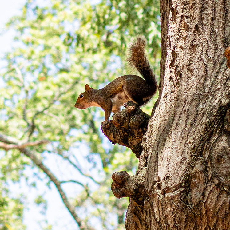
- The first grid image is marked as decorative. This effectively makes the accessible link name for the first grid item, "Alt Text
in the CMS. Be on the lookout in the CMS for places to add alt text to your images."
It is actually better to mark the image of the squirrel as a decorative image so that the link name does not become too lengthy and so that the function of the
link is clear in the link name.
- However, the second grid image does require alt text. The image contains text on a digital sign, which is not included in our link text otherwise. The full link name, including the image's alt text, should be: "Follow Us @UofSC on Instagram, TikTok, and X. Alt Text in Social Media. Each social media platform has its own guides for adding alt text to your images."
Of course, this second link name could easily confuse someone using a screen reader into thinking that the link will take them to a page where they can follow @UofSC on social media. To make the purpose of this link clearer, it would be better if only the title were linked instead of the entire grid item.
It's best to be consistent with how you link your grid items—if you make the title the link in one grid item, make the title the link for all items within the snippet.
Note: If the linked image were the only item in the link—or in other words, if the link didn't include visible text—then the images would need alt text to convey the purpose of the link to somebody using a screen reader.
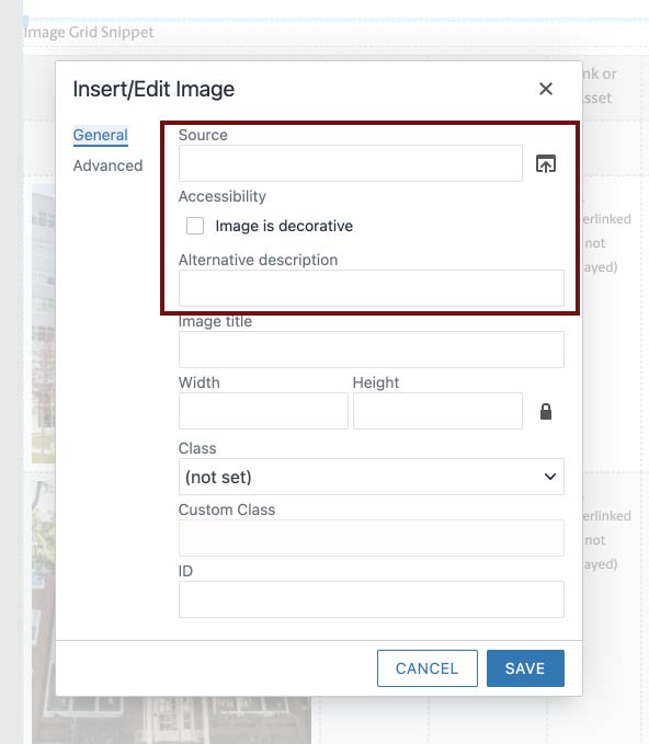
Adding & Replacing Alt Text
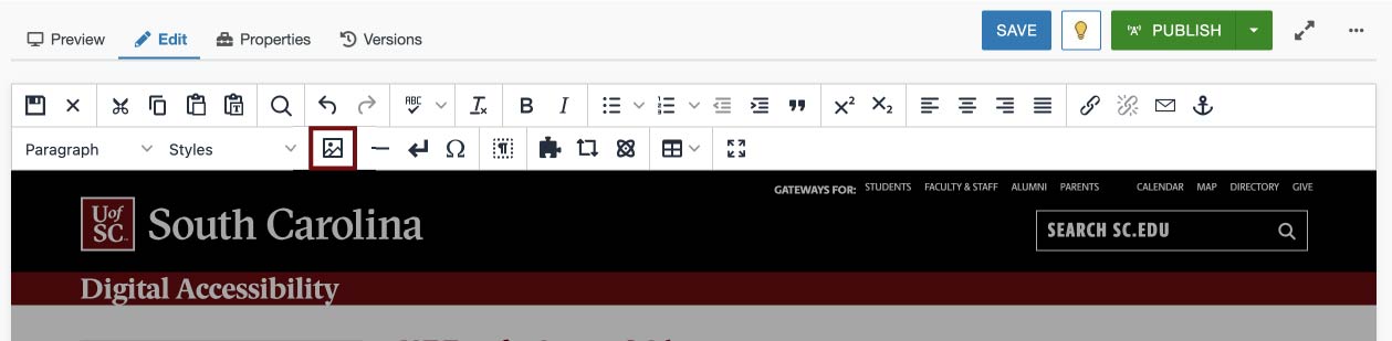
- Select your image, then click the Image icon to get to the Insert/Edit options.
- Determine if you should mark your image as decorative or not. You can tell screen
readers to skip your decorative image if it conveys absolutely no important visual
information, if it merely repeats information that is already on the page, or if its
alt text would detract from the purpose of the link.
- Add your alt text to the "Alternative description" box or select the "Image is decorative"
checkbox. Click "Save" to confirm.