Highlight Boxes
Begin highlight boxes with a heading 3 to call attention to the information they are presenting.
The CMS lets you set paragraph styles to create headings and define the structure of your page. Proper page structure makes a big difference for those using assistive technology and also makes your content easier to digest.
Headings are for indicating the structure of your content, not for making your text look big or bold. Screen readers allow users who are blind or low vision to navigate a page by heading levels. It is important that headings are marked up using the styles built into the CMS so that heading navigation works as expected.
If you simply need to make part of your content stand out, try using:

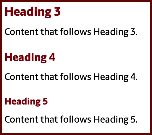
The template you are working within to manage your CMS content generally has pre-assigned content areas for headings 1 and 2. For that reason, you'll start with heading 3 (or h3) as your main headings for your content, then add subheadings for each h3 in sequential order (h4, h5, h6) as needed.
Exception: On the home page, you will need to add a heading 2 as the first heading in your main content area. On other pages, the heading 2 precedes the introduction paragraph, but this is not the case on the home page.
Whether you're building content on the home page or not, be sure not to skip heading
levels. For instance, do not skip directly from a heading 3 to a heading 5 without
a heading 4 nested between them. You can, however, jump back to a heading 3 from a heading 5.
You can catch heading issues, including skipped heading levels or empty headings, by toggling on "Show Content Blocks" in the toolbar to show you each line's styling (paragraph, heading 3, etc).
Watch out for empty heading blocks: If any blocks show a heading style where the line is empty, you will need to delete the empty line. Avoid pressing "Enter" when your cursor is at the beginning of a heading content block because this action creates an empty heading. If you need extra white space between content blocks, use a soft return instead by pressing "Shift+Enter".

Some CMS snippets automatically present information using particular heading levels. You cannot change the heading levels in these snippets. Instead, you will need to make sure that your content still follows a logical heading order by adding headings before the snippet.
Begin highlight boxes with a heading 3 to call attention to the information they are presenting.
These snippets automatically use a heading 3 as the heading level, unlike flexible grid snippets where you can choose the heading level.
These lists automatically use a heading 4 as the heading level. To preserve heading hierarchy, add a descriptive heading 3 before the multipurpose list to introduce it.
The news feed snippet automatically uses a heading 4 for news story titles. Add a descriptive heading 3 before your news feed to maintain heading hierarchy.
These snippets automatically use a heading 4 as the heading level. To preserve heading hierarchy, add a descriptive heading 3 before the simple list to introduce it.
Learn how to add headings and use proper hierarchy.